
In a blog post on paulcalvano.com, I shared some insights into the growth of the web, as measured by an increase in the number of origins in the Chrome User Experience Report. This post shares the SQL queries and data I used to prepare that article.
Global Growth of Domains Accessed in 2020
The graph below illustrates the total number of websites and registered domains that the Chrome User Experience reported across all form factors during the previous 12 months.
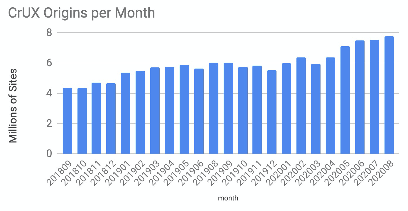
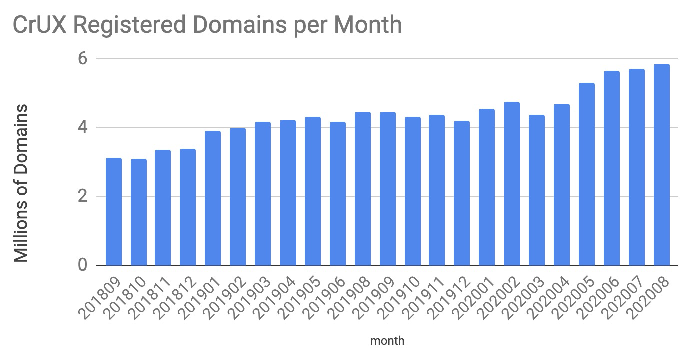
The SQL I used for creating this table is below. It simply counts the number of origins, registered domains and top level domains in each table of the dataset.:
SELECT
   _TABLE_SUFFIX AS month,
   COUNT(DISTINCT origin) AS sites,
   COUNT(DISTINCT NET.REG_DOMAIN(origin)) AS registered_domains,
   COUNT(DISTINCT NET.PUBLIC_SUFFIX(origin)) AS top_level_domains
FROM
   `chrome-ux-report.all.*`
GROUP BY
   month
ORDER BY
   month ASC
Mobile vs Desktop Growth
This next graph illustrates the number of origins by form factor

The SQL used for this is similar to the previous query, but includes the form factor as a grouped column:
SELECT
    _TABLE_SUFFIX AS month,
    form_factor.name As form_factor,
    COUNT(DISTINCT origin) AS sites,
    COUNT(DISTINCT NET.REG_DOMAIN(origin)) AS registered_domains,
    COUNT(DISTINCT NET.PUBLIC_SUFFIX(origin)) AS top_level_domains
FROM
    `chrome-ux-report.all.*`
GROUP BY
    month,
    form_factor
ORDER BY
    month,
    form_factor ASC
How Has this Varied by Region?
The tables below detail the number of sites included in the CrUX dataset during December 2019 as well as January, May, June and August 2020.

The SQL used for this uses a technique that @rick wrote about a while back, where you can assign a subregion to each country in the dataset. It’s too large to paste in this article, so you can find it here - https://console.cloud.google.com/bigquery?sq=226352634162:5cae584e069d49838aec9407d7e8c788
Analyzing by Top Level Domain
The next two graphs show the distribution of websites by TLD.
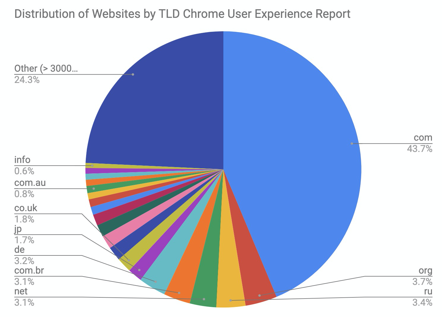

The SQL for this is below, and the graphs were created by creating pivot tables from the results
SELECT
    month,
    NET.PUBLIC_SUFFIX(origin) AS tld,
    COUNT(*) AS sites
FROM (
    SELECT DISTINCT "202008" AS month, origin FROM `chrome-ux-report.all.202008`
    UNION ALL
    SELECT DISTINCT "202007" AS month, origin FROM `chrome-ux-report.all.202007`
    UNION ALL
    SELECT DISTINCT "202006" AS month, origin FROM `chrome-ux-report.all.202006`
    UNION ALL
    SELECT DISTINCT "202005" AS month, origin FROM `chrome-ux-report.all.202005`
    UNION ALL
    SELECT DISTINCT "202004" AS month, origin FROM `chrome-ux-report.all.202004`
    UNION ALL
    SELECT DISTINCT "202003" AS month, origin FROM `chrome-ux-report.all.202003`
    UNION ALL
    SELECT DISTINCT "202002" AS month, origin FROM `chrome-ux-report.all.202002`
    UNION ALL
    SELECT DISTINCT "202001" AS month, origin FROM `chrome-ux-report.all.202001`
    UNION ALL
    SELECT DISTINCT "201912" AS month, origin FROM `chrome-ux-report.all.201912`
)
GROUP BY month, tld
You can also see all the data used for these graphs in this Google Sheet.